From day one of launching this company, our vision has been to become Australia’s recognised leader in architectural perforated metal products. From day one, Metrix Group have always differentiated the company by focusing on customer service.
While that still remains true today, we have refined our product offering, realigned our staff to be more customer centric and finally, we have more clearly interpreted what our customers want.
There are so many uses for perforated metal, so many companies who manufacture perforated metal and so as a company, we had to have a long think about where Metrix Group belongs in that ecosystem.
Owner and Managing Director Kelvin Morley had this to say on the rebrand:
“As our product range has evolved from standard 2D patterns of cladding to innovative 3D artform systems, it became clear that our old brand no longer reflected who we are or what we did as a company. Our vision was always clear and now our focus has shifted in line with that.”
There are many key reasons for why we decided to make the change. Rebranding is not an endeavour that we take lightly. For us it’s more than just a new logo.
Owner and Financial Director Nigel Morley spoke the decision to rebrand now:
“We had been planning to align the brand with the new strategic direction and product changes in the second half of 2020. As we manoeuvred the challenges of COVID, we were still mindful of the risk of looking outdated or irrelevant. Simply put, we needed an improved way to speak to our audience and a better way to tell our story – more often.”
Further, we wanted to refresh our style. This wasn’t the most important reason for the rebrand but we felt our previous branding didn’t reflect our high level of product development and the accompanying assets we needed to promote the products.

our only legacy item from the past brand identity, the new colours and shapes have helped create a set of guidelines to reshape our whole look and feel – starting with a new website.
When we began this process, our website was just under 7 years old. In web terms, that’s retirement age. We initially considered a face-lift of sorts but with current best practice web design and critical features and tools to be added – we settled on a complete overhaul which we are looking to launch early in the second half of the year.
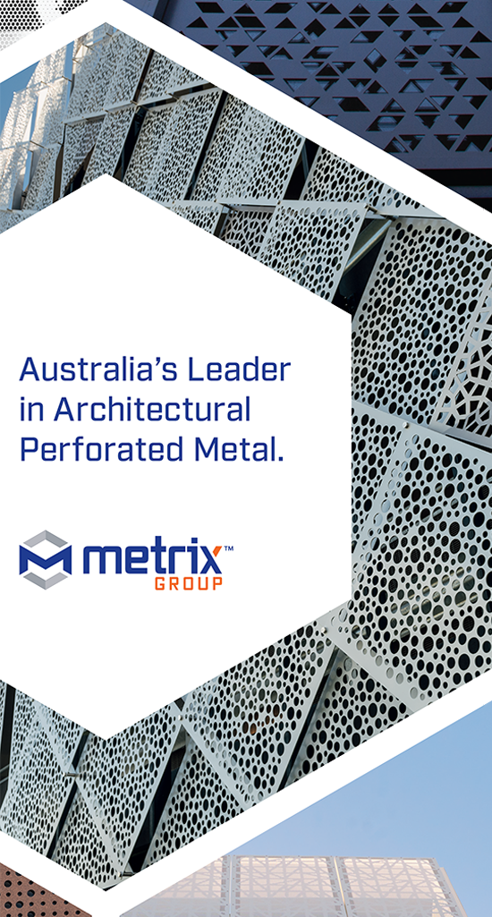
The new logo has the addition of a strong icon in the hexagon. And while the hexagon is not a traditional or standard perforation – neither are Metrix Group. You will see the hexagon used in design, our legacy blue and splashes of the bold orange throughout our new assets in the very near future.

